Page MenuHomePhabricator

iOS app does not present edit notices
Closed, ResolvedPublicBUG REPORT

Assigned To
Authored By
TheDJ
Aug 9 2018, 9:24 AM
Referenced Files
F36889324: Screenshot 2023-03-02 at 1.36.55 PM
Mar 2 2023, 7:41 PM
F36887454: IMG_5059.PNG
Mar 1 2023, 10:16 PM
F36887453: IMG_5058.PNG
Mar 1 2023, 10:16 PM
F36887436: Screenshot 2023-03-01 at 1.45.13 PM.png
Mar 1 2023, 10:16 PM
F36864699: IMG_0541.PNG
Feb 22 2023, 9:13 AM
F36864696: IMG_0543.PNG
Feb 22 2023, 9:13 AM
F36849078: Group 1.png
Feb 15 2023, 1:30 PM
F36845866: Group 3.png
Feb 15 2023, 1:30 PM

Description

Editnotices are an important part of educating users and trying to prevent them from making mistakes when creating and/or modifying content. These notices are currently not presented in the iOS interface.

See also: https://en.wikipedia.org/wiki/Wikipedia:Editnotice
Related: T201595: Mobile frontend web does not present edit notices and T201597: Android app does not present edit notices

New designs

🔗Figma: https://www.figma.com/file/45pImZnxiD2BZiLSpvs2qt/iOS-on-wiki-communication?node-id=0%3A1&t=CfV4OK9Z8tkJ1EcB-1

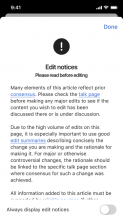
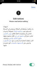
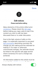
When an editor accesses the editing view of an article with an edit notice a model with the edit notice presented natively should be shown. Editors may opt out of this automatic presentation of edit notices by toggling the 'Always display edit notices' element in the model.

Edit notices and & how the toggles 'on/off' behavior affects the actions/views

  • When an editor lands on an article with an edit notice for the first time and decides to edit that article the edit notice shows up in a modal with the toggle set to 'ON' (before they are able to edit). The modal gets dismissed when the editor taps on 'OK'. Once the modal is dismissed, the edit notice collapses into an 'exclamationmark.circle.fill' icon on the edit toolbar at the top of the page.
  • When the editor decides to edit any further articles with edit notices (with the toggle turned to 'Off) the edit notices will not show up as a modal anymore but the icon will just appear in the toolbar. Tapping on the icon will show the modal once again.
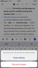
  • If the editor decides to edit an article (with the toggle on 'off' and this is not their first time landing on an article with an edit notice and the icon is in the toolbar) they start editing, but then decide to open up the edit notice -> tap the icon -> modal opens and they decide to tap on a blue link, then an action sheet will show up asking if they want to go back to editing or to discard changes and open the link (we cannot save those edits before they are published).
  • If the editor turns the toggle to 'On' then whenever they decide to edit any other articles with edit notices the edit notices will always show up as a modal before the editor has the chance to edit and they will have to dismiss it by tapping 'Ok' every time.
  • When an editor decides to edit an article with no edit notice, then no modal shows up and there is no 'exclamationmark.circle.fill' icon on the edit toolbar at the top of the page.

See designs in table

Editor tapping to edit an article an article with and edit notice for the first time

Editor decides to edit an article with and edit notice (for the first time)Tap to edit and the edit notice modal appearsTapping 'Ok' dismisses the which now can be re-opened by tapping on the 'exclamationmark.circle.fill' icon
Article.png (667×375 px, 65 KB)
toggle on.png (667×375 px, 43 KB)
Editing notice hidden.png (667×375 px, 63 KB)

Edit notices (2+n time tapping to edit an article with an edit notice, with the toggle turned off)

ArticleEdit view with edit notice icon in top toolbarEdit notice modal triggered by tapping on the icon
Article.png (667×375 px, 65 KB)
Editing screen-1.png (667×375 px, 63 KB)
Edit notice full page.png (667×375 px, 43 KB)

Edit notices (2+n time tapping to edit an article with an edit notice, with the toggle turned on)

ArticleTapping to edit an article with edit notice (toggle 'on')Dismissing modal by tapping 'Ok'
Article.png (667×375 px, 65 KB)
toggle on.png (667×375 px, 43 KB)
Editing screen-1.png (667×375 px, 63 KB)

Starting to edit -> opening the edit notice -> then deciding to tap on a blue link

ArticleTap to editTap on edit notice iconTapping on blue link triggers action sheetTapping on 'Keep editing'Tapping on 'Discard changes'
Article.png (667×375 px, 65 KB)
Editing with edit notice icon.png (667×375 px, 69 KB)
Edit notice full page.png (667×375 px, 43 KB)
Tapping on a link.png (667×375 px, 62 KB)
Edit notice full page.png (667×375 px, 43 KB)
Tapping on Discard changes.png (667×375 px, 71 KB)

Previously proposed designs

🔗Figma: https://www.figma.com/file/VKPxDQeZQ6h2S45j3oZkNt/Editing-on-iOS?node-id=104%3A30141

Presenting the notice

When an editor accesses the editing view of an article with an edit notice a model with the edit notice presented natively should be shown. Editors may opt out of this automatic presentation of edit notices by toggling the 'show edit notices automatically' element in the model.

Full page modalFull page alert
image.png (812×375 px, 60 KB)
image.png (812×375 px, 65 KB)
Preferred designBack-up design

Re-accessing notices from Edit view

After the model is dismissed, editors can access the notice via the header in the editing toolbar. If no editing notice is associated with the article, then the alert icon should not be shown. Tapping on the alert icon will re-trigger the model.

Keyboard upKeyboard down
image.png (812×375 px, 64 KB)
image.png (812×375 px, 74 KB)

API Notes

Like Android, we will be pulling edit notice data from the Visual Editor API (see source).

Here's an example API call.

Quick caveat: the VisualEditor API has some minor issues where it doesn't return all edit notices, most notably the BLP template. https://phabricator.wikimedia.org/T56029

Note for QA

As a part of this, please regression test page protection logic on our editor, to be sure it still works as before. Our plan is to release blocked work, edit notices and abuse filter work before we pick up T313772.

Event Timeline

There are a very large number of changes, so older changes are hidden. Show Older Changes

Has something changed? When I go to Leslie Feinberg or Faizabad district, I can see the edit notice the first time, but not if I exit and come back in. I'm sorry I can't give exact reproduction steps, it doesn't seem stable enough that I can reproduce it exactly, but I definitely saw the edit notice for each one in the last few minutes on mobile view on iPhone/iOS 15.6.1 in Safari. I switched to iOS Chrome browser app and it also shows the edit notice; screen shot attached. Switched to Opera browser/iOS, and the edit notice looks identical to the screen shot.

Edit notice at Leslie Feinberg in mobile view on iOS 15.6.1 Safari 2022-09-23 at 22.43.36.png (1×591 px, 320 KB)

Never mind, I'm on the wrong ticket; this was about Mobile web, not mobile app. Sorry.

Notes from sync:

Notes from engineering sync:

Can we have some more detail in the description about the business logic behind the toggle?

A couple of questions I can think of to solidify: is it toggled on by default? Should the device remember the setting after app termination (i.e. should we persist the flag), etc. Also just want to confirm that it only controls the automatic presentation of the alert modal once the editor appears (it does not power the visibility of the toolbar button), correct? @OTichonova Thanks!

  • The toggle should be on my default, why? well the community members that created the chart raised edit notice as a key tool for informing new editors.
  • Toggle exists to allow users to determine if they want to see those notices each time or if it should nest in the top toolbar. By having them choose even if they turn it off, they know where to go to see that a notice exists
  • Should the app remember? Yes
  • I will leave the last question to @OTichonova

Hi @Tsevener!
Answers to the question below can be found in the description at the top of the ticket. Let me know if more information is needed!

Also just want to confirm that it only controls the automatic presentation of the alert modal once the editor appears (it does not power the visibility of the toolbar button), correct?

  1. user lands on editor for the FIRST time (i.e. they have never had an opportunity to see toggle) and there is an edit notice
  2. user lands on editor for the SECOND or more time, there is an edit notice, and their toggle setting is ON
  3. user lands on editor for the SECOND or more time, there is an edit notice, and their toggle setting is OFF
  4. user lands on editor and there is no edit notice
OTichonova moved this task from Needs Design to Ready for Development on the ios-app-v7.1 board.
OTichonova subscribed.

@OTichonova Thanks for looking into the logic questions above.

A big change here from the original designs is that the preferred presentation style (full page modal) no longer appears to be present, favoring the alert modal instead. I feel the original full page modal presentation approach would definitely be more straightforward to build, support, and maintain going forward over the alert style modal, especially considering how much long form content it may have to display. Would it still be your preference presenting this in a full page modal, or is the preference now this alert modal approach?

Hi @Dmantena!

Yeees, there has been that change. I decided to go with the modal rather than the full sheet because:


  1. These notices shouldn’t really fill the whole screen and block the whole page. On web they are displayed in a popover underneath the icon while on mobile web they are displayed as a modal. So I wanted to display it in a way where they do not block the whole screen.
  2. To my understanding on iOS we have full sheet modals, sheets (for actions), alerts and action sheets to display information. In light of working on standardising our alerts/notices in the app this google sheet was created a couple months back. I have added another ‘modal’ type component that would allow us to display important information and leave the full sheets for onboarding and introducing new features (like in notifications).

The question I have is - are there other modal type solutions that we could use in this case that would be simpler to implement?

Notice: mobile webNotice: web
IMG_0301 1.png (667×375 px, 64 KB)
Screenshot 2023-01-23 at 20.49.45.png (1×2 px, 752 KB)

Hiya @OTichonova -

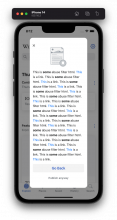
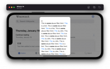
Since your comment we've been tinkering a bit over here on what we can do quickly. If we are to go with your modal, we'll be mainly limited to what our current panels can do out of the box, which looks and acts like this:

IMG_0150.PNG (2×1 px, 945 KB)

IMG_0151.PNG (1×2 px, 1 MB)

(Note I didn't actually change the image to the yellow warning icon, but you get the idea).

There's no subtitle place for "Please read before editing", the OK button looks different, the X placement is different, in landscape mode the image disappears and crucially, the OK button (and future toggle) will scroll with the content and hide beneath the fold. I don't really want to tweak this functionality due to the risk it creates for all of the other panels that display in the app. Plus components is right on this feature's heels, so perhaps we can make a new panel component at that time that does the things you want here. On top of this there's also this strange theming bug that manifests again in my screenshots which we'll need to fix if we go this route.

All that is to say, I actually think we can get closer to your design in the same amount of time by going with the full sheet modal and having more control than by tip toeing around our existing panels with the design sacrifices. If it helps sell it, Apple's full sheet modals do show the content underneath on iPad. Let me know what you think, thanks!

Hi @Tsevener
Okay, thanks for the screenshots!
I see. Just to clarify - are you proposing the full sheet modal just for the edit notice (because of the added complexity with the toggle and icon and text etc.) or for all the warning messages? Because the edit notice being a full sheet modal is not ideal would be okay as long as the other warning messages can be displayed via a modal.
Thanks!

@OTichonova We'll have the same limitations for all modals, if we're to stick with what we have and not do components-type work now on the panels. So abuse filter, for example, will need to look and act something like this:

Screen Shot 2023-01-24 at 8.12.22 AM.png (1×544 px, 234 KB)

Screen Shot 2023-01-24 at 8.12.29 AM.png (606×960 px, 190 KB)

Again, image can be changed, of course.

We can go either direction, that is, full sheet modal with more UI flexibility, or these panels as they are. Let me know which you prefer, thanks!

Hi @Tsevener,
Okay thank you for clarifying this.
Let's do full screen for edit notices (since they are more complex) and these older modals displayed above for the other alert message. I will update the designs for this today/tomorrow morning.
Thanks!

Hey @Dmantena & @Tsevener
Quick update: The edit notice screens have been updated to full page.

Tsevener added a subscriber: Dmantena.

Hi!
So when I go on pages with edit notices I noticed 5 things:

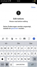
  1. The first time I try to edit a page with an edit notice the keyboard would stay up and wouldn't come down so you couldn't see the full page. When I would exit out of the page and re-enter that wouldn't happen again. But the same thing would occur when I disabled the toggle, let the page, entered, enabled the toggle left and entered it again.
English articleGerman article
IMG_0459.png (667×375 px, 61 KB)
IMG_0462.png (667×375 px, 44 KB)
  1. If the page is also semi-protected the message shows up inside of the full page modal and looks a little strange (but I guess we won't have that once protected pages it worked on, right?)
Edit notice & protected page
IMG_0459.png (667×375 px, 61 KB)
  1. The padding inside of the text/toggle element is not even, it should be 16pts and 16pts top and bottom while currently it is 20 pts on top and 8 pts on the bottom making is seem like it is cut off at the bottom of the page. Could we update to be 16pts top and bottom?
DesignModal in app
Edit notice full page.png (667×375 px, 48 KB)
Group 3.png (674×458 px, 80 KB)
  1. Could we update the main body text to 15pts as it is in the designs, it seems to be 16pts in the app currently?
  1. For RTL (Hebrew in the example below) the text seems to be left aligned, could we have it be right aligned instead?
In app
Group 1.png (667×375 px, 54 KB)
Aklapper changed the subtype of this task from "Task" to "Bug Report".Feb 17 2023, 8:22 AM

Hey @OTichonova -

So when I go on pages with edit notices I noticed 5 things:

  1. The first time I try to edit a page with an edit notice the keyboard would stay up and wouldn't come down so you couldn't see the full page. When I would exit out of the page and re-enter that wouldn't happen again. But the same thing would occur when I disabled the toggle, let the page, entered, enabled the toggle left and entered it again.

Thanks for pointing it out - it was definitely something we noticed but weren't positive how prevalent it was. I'll try and find a solution that prevents the keyboard from appearing.

  1. If the page is also semi-protected the message shows up inside of the full page modal and looks a little strange (but I guess we won't have that once protected pages it worked on, right?)

Correct, we haven't yet tackled the protected pages update but ideally the protection toast message shouldn't appear here. Will try to remove it.

  1. The padding inside of the text/toggle element is not even, it should be 16pts and 16pts top and bottom while currently it is 20 pts on top and 8 pts on the bottom making is seem like it is cut off at the bottom of the page. Could we update to be 16pts top and bottom?

Sure thing, I will update these to be 16pt top and bottom. But just as a heads up, I want to be clear that these may render slightly differently depending on the device they are presented on. This bottom container is constrained to what's called the "safe area layout guide", which is a layout guide that ensures our UI isn't drawn over any other system elements. An example of these system elements are things like the bottom Home bar on devices without a home button, and elements like the Dynamic Island. So on a device with a home button, the bottom may be exactly 16pts, but on a device without a home button, there may be a little extra bottom padding the system adds to not occlude the home bar.

  1. Could we update the main body text to 15pts as it is in the designs, it seems to be 16pts in the app currently?

Sorry, I missed that and used the wrong dynamic type element. Updating!

  1. For RTL (Hebrew in the example below) the text seems to be left aligned, could we have it be right aligned instead?

Can you provide an article you're seeing this on?

Hey @OTichonova – I've got fixes for all this stuff done except for the RTL issue. When you get a chance can you provide an article you're seeing this issue with?

  1. For RTL (Hebrew in the example below) the text seems to be left aligned, could we have it be right aligned instead?

Can you provide an article you're seeing this on?

Hi @Dmantena!
Sorry I missed this. As I am looking now and cannot find a Hebrew article with an edit notice, but I found one in Arabic where the text seems to be aligned to the wrong side as well. So edit notice in RTL languages seem to align left rather than right in the edit notice view.

Article: نادي ليفربول

articleedit notice
IMG_0543.PNG (1×750 px, 581 KB)
IMG_0541.PNG (1×750 px, 181 KB)

@OTichonova question after some feedback from QA - we didn't do this work for the article description editor. Are edit notices expected in that context as well? It would be a large addition, so if you want it I suggest we spin off a separate task & mock up where the exclamation point nav bar button would go, so that way this task is freed to release in its current form.

ABorbaWMF subscribed.

Testing on 7.2.0 (2060)

Moving this ticket to blocked or waiting due to an issue with the Edit notice when looking across articles from multiple languages. I used this list page to find some articles and @Tsevener also provided some. I found that the edit notice displayed inconsistently

Screenshot 2023-03-01 at 1.45.13 PM.png (848×1 px, 97 KB)

Articles where it appears to work:
Covid-19 in English
Earth in English
Erde in German
نادي ليفربول In Arabic

A fairly large number of the articles I tested it does not appear to work. In these case neither the Edit Notice or the Edit Notice Icon were present:
Homer Simpson in English does not work, but Homer Simpson in German does
Beyoncé in English does not work, but Beyoncé in German does
I tried a number of articles from the list page above and most did not work, for example: Drug, Hello, Burger King, Effects of Climate Change (although the Climate Change article worked fine), and more

Hi @Tsevener,
So for article description we don't need to display edit notices as Android doesn't display them either. We should however display blocked messages, abuse filters and page protection messages.

@ABorbaWMF I may be getting mixed up in the distinction between edit notices and page protection messages, but from a strictly API standpoint, we are only displaying messages that the API indicates as an "edit notice".

Here's the API response for DE Homer Simpson:

"notices": {
      "revreview-editnotice": "<p><b>Deine Änderungen werden angezeigt, sobald sie <a href=\"/wiki/Hilfe:Gesichtete_Versionen\" title=\"Hilfe:Gesichtete Versionen\">gesichtet</a> wurden.</b>\n</p>",
      "semiprotectedpagewarning": "<p><b>Teilschutz:</b> Für nicht angemeldete oder gerade eben erst angemeldete Benutzer ist der Schreibzugriff auf diese Seite gesperrt. Gründe für den Teilschutz finden sich im <a class=\"external text\" href=\"https://de.wikipedia.org/w/index.php?title=Spezial:Logbuch/protect&amp;page=Homer_Simpson\">Seitenschutz-Logbuch</a>, auf der <a href=\"/wiki/Diskussion:Homer_Simpson\" title=\"Diskussion:Homer Simpson\">Diskussionsseite</a> oder in den <a href=\"/wiki/Wikipedia:Gesch%C3%BCtzte_Seiten\" title=\"Wikipedia:Geschützte Seiten\">Regeln für geschützte Seiten</a>. Auszug aus dem Seitenschutz-Logbuch:\n</p>..."
}

Here's the API response for EN Homer Simpson:

"notices": {
      "semiprotectedpagewarning": "<div id=\"semiprotectedpagewarning\" style=\"text-align: center;\">\n<p><b>Note:</b> This page is <a href=\"/wiki/Wikipedia:Protection_policy#Semi-protection\" title=\"Wikipedia:Protection policy\">semi-protected</a> so that only <a href=\"/wiki/Wikipedia:User_access_levels#Autoconfirmed_users\" title=\"Wikipedia:User access levels\">autoconfirmed users</a> can edit it. If you need help getting started with editing, please visit the <a href=\"/wiki/Wikipedia:Teahouse\" title=\"Wikipedia:Teahouse\">Teahouse</a>.\n</p>..."
}

We did not include protected page warnings as a part of this task (which is the only notice type returned for EN Homer Simpson). The plan is for protected page work to be tacked in T313772, which we have not picked up yet.

Hope that helps! Of course let us know if this seems like the wrong task description interpretation. You can look at these notice messages from the API by pasting this in your browser and (change language and page title as needed), if you need to cross-check yourself or compare with the Android implementation.

https://en.wikipedia.org/w/api.php?action=visualeditor&errorsuselocal=1&format=json&formatversion=2&paction=metadata&page=Homer_Simpson

@Tsevener Yes, I was not sure about that either. There's no option to filter for 'edit notices' on this page. Do we know if there is another way to find a list of articles to test against?

Here are the options on the list of protected pages.

Screenshot 2023-03-01 at 1.45.13 PM.png (848×1 px, 97 KB)

@ABorbaWMF there may be a better way to do this, but one thing I've found is to search for pages titled with the "Template:Editnotices/Page/" prefix, that end with a title that looks like a real article accessible from the app:

Screenshot 2023-03-02 at 1.36.55 PM (453×729 px, 81 KB)

Autocomplete seems to work better here for me, when I tap "Search" I can't find those real-looking articles in the search results. But of this autocomplete list, "Basshunter", "Donald Trump", and "List of NHL statistical leaders" all have an edit notice that presents in the app when you try to edit them.

@ABorbaWMF actually this method might work better, here's a prefix search API call:

https://en.wikipedia.org/w/api.php?action=query&list=prefixsearch&pssearch=Template%3AEditnotices%2FPage%2F&pslimit=500

Try out any articles in here (the ones not specifying a namespace). Any of the other namespaces won't open in our article view or section editor, so you can ignore those.

For better or worse, google search is often better than our advanced search. Not sure if that's the case here, because I don't know if that JSON result was all of it, or has continuation pages. In any case, googling site:en.wikipedia.org intitle:"Template talk:Editnotices/Page/" claims 756 results. You can see google's ranking algo trying to pick out the "most relevant" ones, and my guess is that because the query is so technical, PageRank is almost all of it, with "popular" pages bubbling to the top.

Please do any final testing against TestFlight build 7.2.0 (2061).

Looks good to me using the articles @Tsevener provided. Ready for signoff on 7.2.0 (2061)

JTannerWMF claimed this task.