Problem:
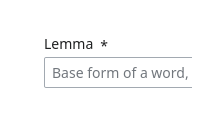
The marker that marks a field as required on Special:NewLexeme is problematic:
- It is tiny
- It has a large gap before it
3. it has no tooltip (fixed)
4. it does nothing if you click on it (Not required, the marker is only an indicator)
5. it is not following the style used by MediaWiki elsewhere (It follows the potential future design direction set by the Design System team. Though this is currently undefined.)
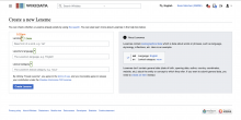
Screenshots/mockups:
Solution:
We should apply contextual adjustments to the WiKit component:
- Increase the font-size of the asterisk span that accompanies the label to 1.5em (font-size-xxlarge), to bypass Vector's default font-size).
- Override the gap between the label and the asterisk, reducing it to 0.25em (dimension-spacing-xsmall).
Acceptance criteria:
- The required marker displays a bigger size that makes it more visible
- The distance between the required marker and the field label is reduced to support the meaning

